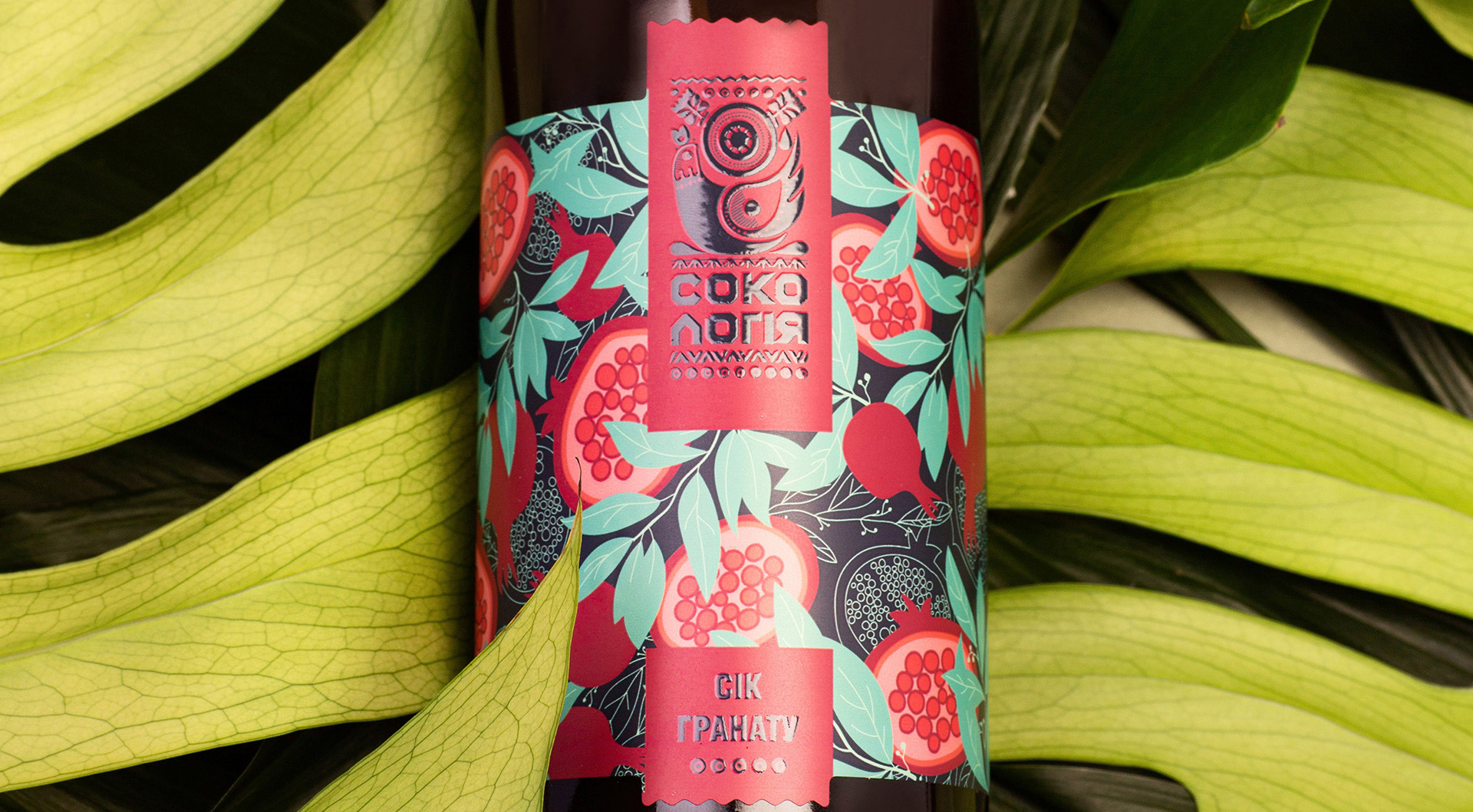
SOKOLOGIA HEALTHY JUICES
Sokologiya is a Ukrainian brand of natural cold-pressed phyto concentrates made from herbs, fruits, and roots. It’s the concentrated energy of nature — created to support daily health, vitality, and well-being.
The Sokologiya team approached us to create packaging design that feels modern and recognizable, yet deeply natural and rooted in Ukrainian aesthetics.
For the brand, it was essential to express its origin — the harmony of beauty, health, and the living energy of nature.
The Sokologiya team approached us to create packaging design that feels modern and recognizable, yet deeply natural and rooted in Ukrainian aesthetics.
For the brand, it was essential to express its origin — the harmony of beauty, health, and the living energy of nature.
CLIENT: Sokologia SERVICES: Logo & Packaging design COUNTRY: Ukraine


KEY CHALLENGES:
- Design a modern yet authentically Ukrainian identity.
- Convey the natural essence of phyto concentrates beyond “just juice.”
- Balance vivid colors with the organic softness of natural forms.
- Maintain a consistent brand look across diverse SKUs.
KEY DESIGN SOLUTIONS:
- Ethno-aesthetic as the basis of identity: the visual system incorporates ornamental motifs and illustrations inspired by Ukrainian nature and decorative art.
- Symbolic logo: a spring bird and a rising sun. The sun represents life, warmth, and renewal; the bird — rebirth, beauty, and freedom.
- Strong illustrative language: for each of the 20 SKUs, a unique illustration was created; all share a unified style, but each has its own composition and character, highlighting the uniqueness of the product.
- Unlimited palette: color combinations can vary depending on the ingredients, but all solutions remain recognizable thanks to the structure, style, and character of the illustrations.

RESULTS FOR THE CLIENT:
- Successful Market Launch: Sokolohiya first gained popularity in the Ukrainian market, and its vibrant, recognizable design attracted the attention of distributors, paving the way for a successful launch in the Polish market.
- Design that Builds Trust: The eye-catching visuals drew attention — and through design, consumers perceived the product’s true quality.- Strengthened Brand Identity: The new style made Sokologiya both modern and deeply authentic.
- Scalable Design System: The flexible color and illustration approach allows the brand to expand effortlessly while staying visually consistent.